![]()
![]()
ggtaichi is a ggplot2 extension that
compares data from two sources on a single grid of taichi (yin-yang)
diagrams. A regular heat map made with geom_tile() encodes
three dimensions (the x, y position and one
value); geom_taichi() turns every cell into a taichi symbol
whose two interlocking fish are filled by two sources
at once, so four dimensions are expressed on one plot.
You can install the development version from GitHub with:
# install.packages("devtools")
devtools::install_github("PursuitOfDataScience/ggtaichi")Each symbol is a circle split by an S-curve into two interlocking fish. The yang (light) fish is shaded by one source and the yin (dark) fish by the other, each on its own gradient. There are no decorative dots: every drop of ink is data.
library(ggtaichi)
library(ggplot2)

one <- data.frame(x = 1, y = 1, google = 7, twitter = 3)

ggplot(one, aes(x, y)) +
  geom_taichi(yin = twitter, yang = google) +
  coord_fixed() +
  theme_taichi()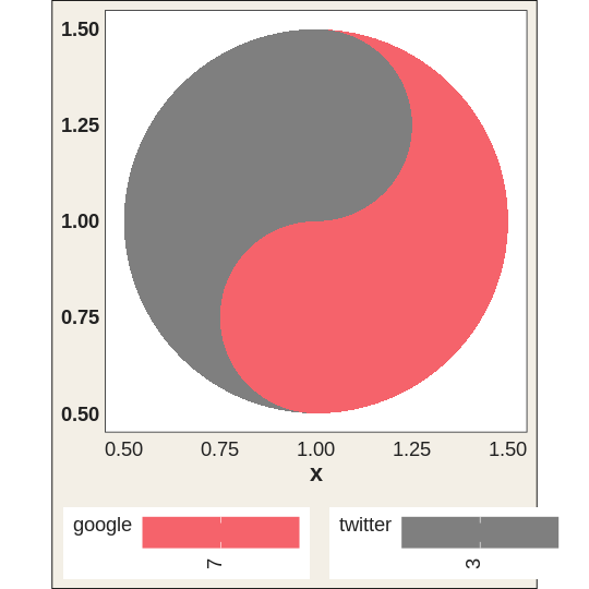
The built-in pitts_tg dataset holds the 30-week
COVID-related Google and Twitter incidence rates for 9 categories in the
Pittsburgh Metropolitan Statistical Area. With many weeks the symbols
shrink, so it is often easier to read a slice. Here are the first six
weeks, where each taichi is big enough to compare the two halves at a
glance.
pitts_small <- subset(pitts_tg, week <= 6)

ggplot(pitts_small, aes(x = week, y = category)) +
  geom_taichi(yin = Twitter, yang = Google) +
  theme_taichi() +
  ggtitle("Pittsburgh: Google (yang) vs Twitter (yin), weeks 1-6")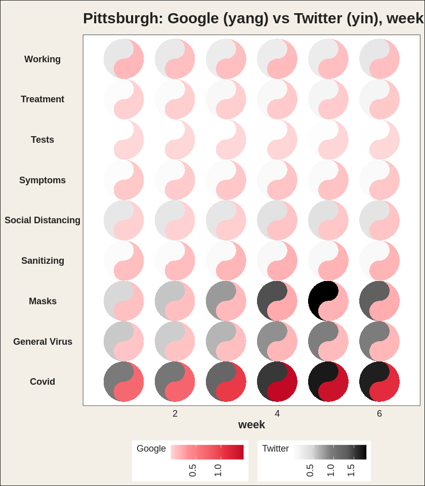
The legend titles default to the column names you supply. Note how
Covid and Masks lean dark (high Twitter) while
staying pink (moderate Google).
Each fish gets its own gradient, and any extra argument is passed
straight to ggplot2::scale_fill_gradientn().
ggplot(pitts_small, aes(x = week, y = category)) +
  geom_taichi(
    yin  = Twitter, yin_name  = "Twitter (%)",
    yin_colors  = c("#deebf7", "#3182bd", "#08306b"),
    yang = Google,  yang_name = "Google (%)",
    yang_colors = c("#fee6ce", "#e6550d", "#7f2704")
  ) +
  theme_taichi()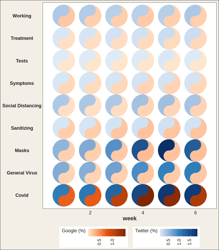
Because geom_taichi() is an ordinary layer, faceting
just works. The states_tg dataset repeats the same
measurements across four states; showing two of them over a handful of
weeks keeps the glyphs large and legible.
two_states <- subset(states_tg, state %in% c("New York", "Texas") & week <= 6)

ggplot(two_states, aes(x = week, y = category)) +
  geom_taichi(yin = Twitter, yang = Google) +
  facet_wrap(~ state, ncol = 1) +
  remove_padding(x = "c", y = "d") +
  theme_taichi() +
  ggtitle("New York vs Texas, weeks 1-6")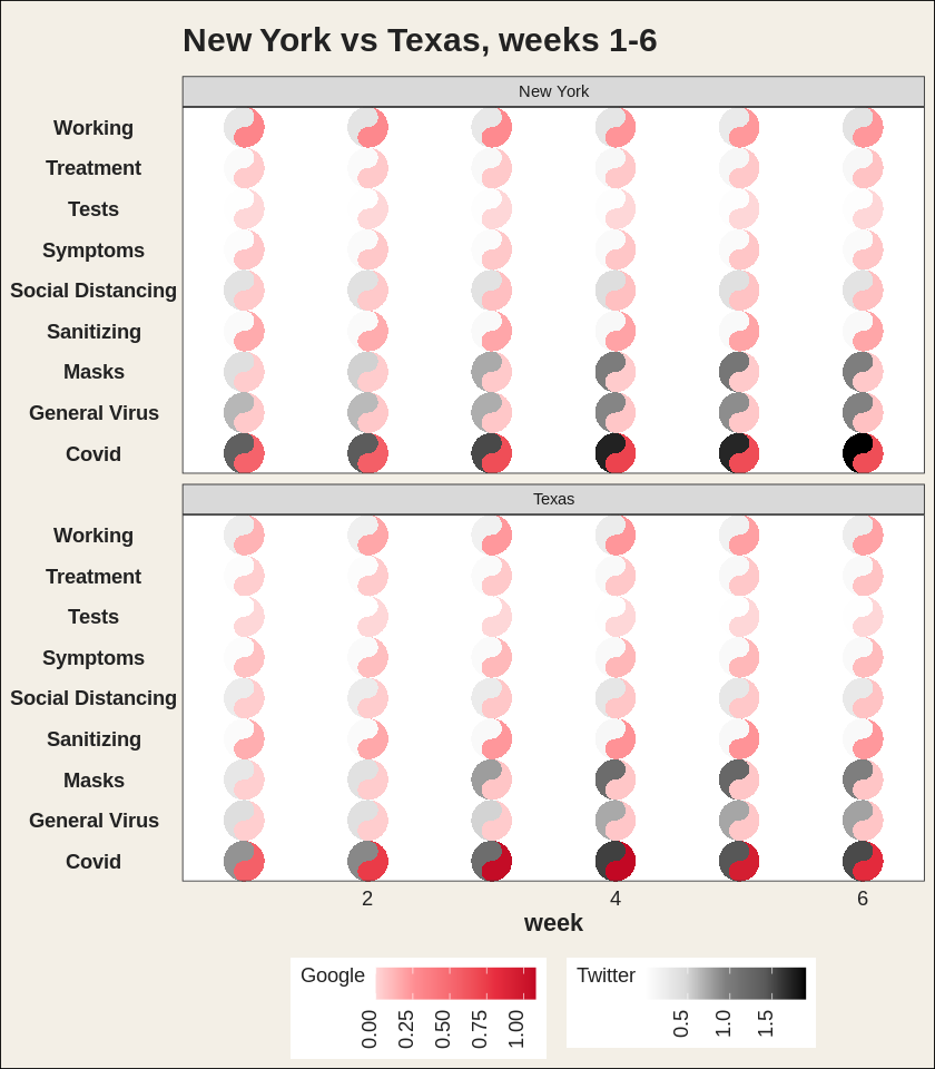
See vignette("ggtaichi") for the full tour.
ggtaichi is built on top of, and is the spiritual
sibling of, the ggDoubleHeat
package, which introduced the idea of folding two data sources into a
single reformed heat map through the geom_heat_*() family.
ggtaichi reuses that two-scale design (and its example
data) and re-imagines the per-cell glyph as a taichi diagram.
ggDoubleHeat is the foundational layer of this package and
should be cited when you use ggtaichi:
Yu Y, Buskirk T (2025). ggDoubleHeat: A Heatmap-Like Visualization Tool. R package version 0.1.3. CRAN: https://CRAN.R-project.org/package=ggDoubleHeat, GitHub: https://github.com/PursuitOfDataScience/ggDoubleHeat
@Manual{,
  title  = {ggDoubleHeat: A Heatmap-Like Visualization Tool},
  author = {Youzhi Yu and Trent Buskirk},
  year   = {2025},
  note   = {R package version 0.1.3.
            GitHub: https://github.com/PursuitOfDataScience/ggDoubleHeat},
  url    = {https://CRAN.R-project.org/package=ggDoubleHeat},
}