
{ggstatsplot}:
{ggplot2} Based Plots with Statistical Details| Status | Usage | Miscellaneous |
|---|---|---|
|
“What is to be sought in designs for the display of information is the clear portrayal of complexity. Not the complication of the simple; rather … the revelation of the complex.” - Edward R. Tufte
{ggstatsplot}
is an extension of {ggplot2}
package for creating graphics with details from statistical tests
included in the information-rich plots themselves. In a typical
exploratory data analysis workflow, data visualization and statistical
modeling are two different phases: visualization informs modeling, and
modeling in its turn can suggest a different visualization method, and
so on and so forth. The central idea of {ggstatsplot} is
simple: combine these two phases into one in the form of graphics with
statistical details, which makes data exploration simpler and
faster.
| Type | Command |
|---|---|
| Release | install.packages("ggstatsplot") |
| Development | pak::pak("IndrajeetPatil/ggstatsplot") |
If you want to cite this package in a scientific journal or in any
other context, run the following code in your R
console:
citation("ggstatsplot")
To cite package 'ggstatsplot' in publications use:

  Patil, I. (2021). Visualizations with statistical details: The
  'ggstatsplot' approach. Journal of Open Source Software, 6(61), 3167,
  doi:10.21105/joss.03167

A BibTeX entry for LaTeX users is

  @Article{,
    doi = {10.21105/joss.03167},
    url = {https://doi.org/10.21105/joss.03167},
    year = {2021},
    publisher = {{The Open Journal}},
    volume = {6},
    number = {61},
    pages = {3167},
    author = {Indrajeet Patil},
    title = {{Visualizations with statistical details: The {'ggstatsplot'} approach}},
    journal = {{Journal of Open Source Software}},
}I would like to thank all the contributors to
{ggstatsplot} who pointed out bugs or requested features I
hadn’t considered. I would especially like to thank other package
developers (especially Daniel Lüdecke, Dominique Makowski, Mattan S.
Ben-Shachar, Brenton Wiernik, Patrick Mair, Salvatore Mangiafico, etc.)
who have patiently and diligently answered my relentless questions and
supported feature requests in their projects. I also want to thank Chuck
Powell for his initial contributions to the package.
The hexsticker was generously designed by Sarah Otterstetter (Max
Planck Institute for Human Development, Berlin). This package has also
benefited from the larger #rstats community on Twitter,
LinkedIn, and StackOverflow.
Thanks are also due to my postdoc advisers (Mina Cikara and Fiery Cushman at Harvard University; Iyad Rahwan at Max Planck Institute for Human Development) who patiently supported me spending hundreds (?) of hours working on this package rather than what I was paid to do. 😁
To see the detailed documentation for each function in the stable CRAN version of the package, see:
| Function | Plot | Description |
|---|---|---|
ggbetweenstats() |
violin plots | for comparisons between groups/conditions |
ggwithinstats() |
violin plots | for comparisons within groups/conditions |
gghistostats() |
histograms | for distribution about numeric variable |
ggdotplotstats() |
dot plots/charts | for distribution about labeled numeric variable |
ggscatterstats() |
scatterplots | for correlation between two variables |
ggcorrmat() |
correlation matrices | for correlations between multiple variables |
ggpiestats() |
pie charts | for categorical data |
ggbarstats() |
bar charts | for categorical data |
ggcoefstats() |
dot-and-whisker plots | for regression models and meta-analysis |
In addition to these basic plots, {ggstatsplot} also
provides grouped_ versions (see below)
that makes it easy to repeat the same analysis for any grouping
variable.
The table below summarizes all the different types of analyses currently supported in this package-
| Functions | Description | Parametric | Non-parametric | Robust | Bayesian |
|---|---|---|---|---|---|
ggbetweenstats() |
Between group/condition comparisons | ✅ | ✅ | ✅ | ✅ |
ggwithinstats() |
Within group/condition comparisons | ✅ | ✅ | ✅ | ✅ |
gghistostats(),
ggdotplotstats() |
Distribution of a numeric variable | ✅ | ✅ | ✅ | ✅ |
ggcorrmat |
Correlation matrix | ✅ | ✅ | ✅ | ✅ |
ggscatterstats() |
Correlation between two variables | ✅ | ✅ | ✅ | ✅ |
ggpiestats(),
ggbarstats() |
Association between categorical variables | ✅ | ✅ | ❌ | ✅ |
ggpiestats(),
ggbarstats() |
Equal proportions for categorical variable levels | ✅ | ✅ | ❌ | ✅ |
ggcoefstats() |
Regression model coefficients | ✅ | ✅ | ✅ | ✅ |
ggcoefstats() |
Random-effects meta-analysis | ✅ | ❌ | ✅ | ✅ |
Summary of Bayesian analysis
| Analysis | Hypothesis testing | Estimation |
|---|---|---|
| (one/two-sample) t-test | ✅ | ✅ |
| one-way ANOVA | ✅ | ✅ |
| correlation | ✅ | ✅ |
| (unpaired) contingency table | ✅ | ✅ |
| (paired) contingency table | ✅ | ❌ |
| random-effects meta-analysis | ✅ | ✅ |
For all statistical tests reported in the plots, the default template abides by the gold standard for statistical reporting. For example, here are results from Yuen’s test for trimmed means (robust t-test):
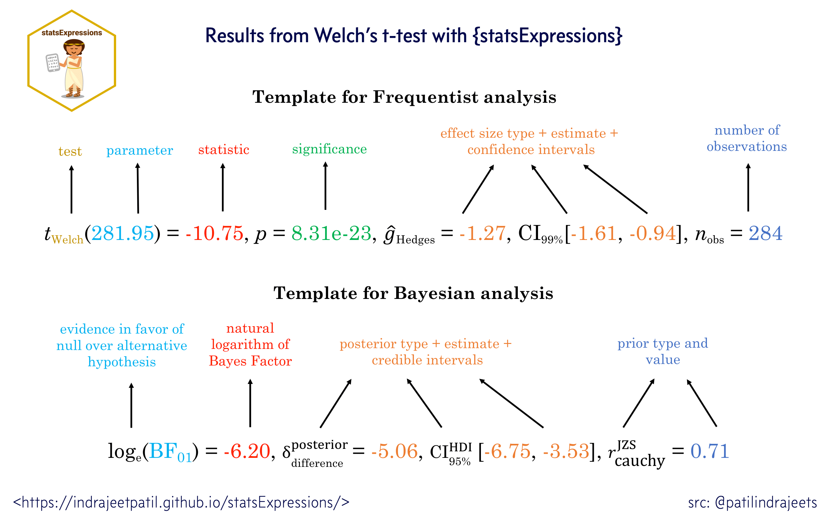
Statistical analysis is carried out by
{statsExpressions} package, and thus a summary table of all
the statistical tests currently supported across various functions can
be found in article for that package: https://www.indrapatil.com/statsExpressions/articles/stats_details.html
ggbetweenstats()This function creates either a violin plot, a box plot, or a mix of two for between-group or between-condition comparisons with results from statistical tests in the subtitle. The simplest function call looks like this-
set.seed(123)

ggbetweenstats(
  data  = iris,
  x     = Species,
  y     = Sepal.Length,
  title = "Distribution of sepal length across Iris species"
)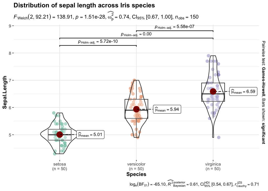
Defaults return
✅ raw data + distributions
✅ descriptive statistics
✅
inferential statistics
✅ effect size + CIs
✅ pairwise
comparisons
✅ Bayesian hypothesis-testing
✅ Bayesian
estimation
A number of other arguments can be specified to make this plot even
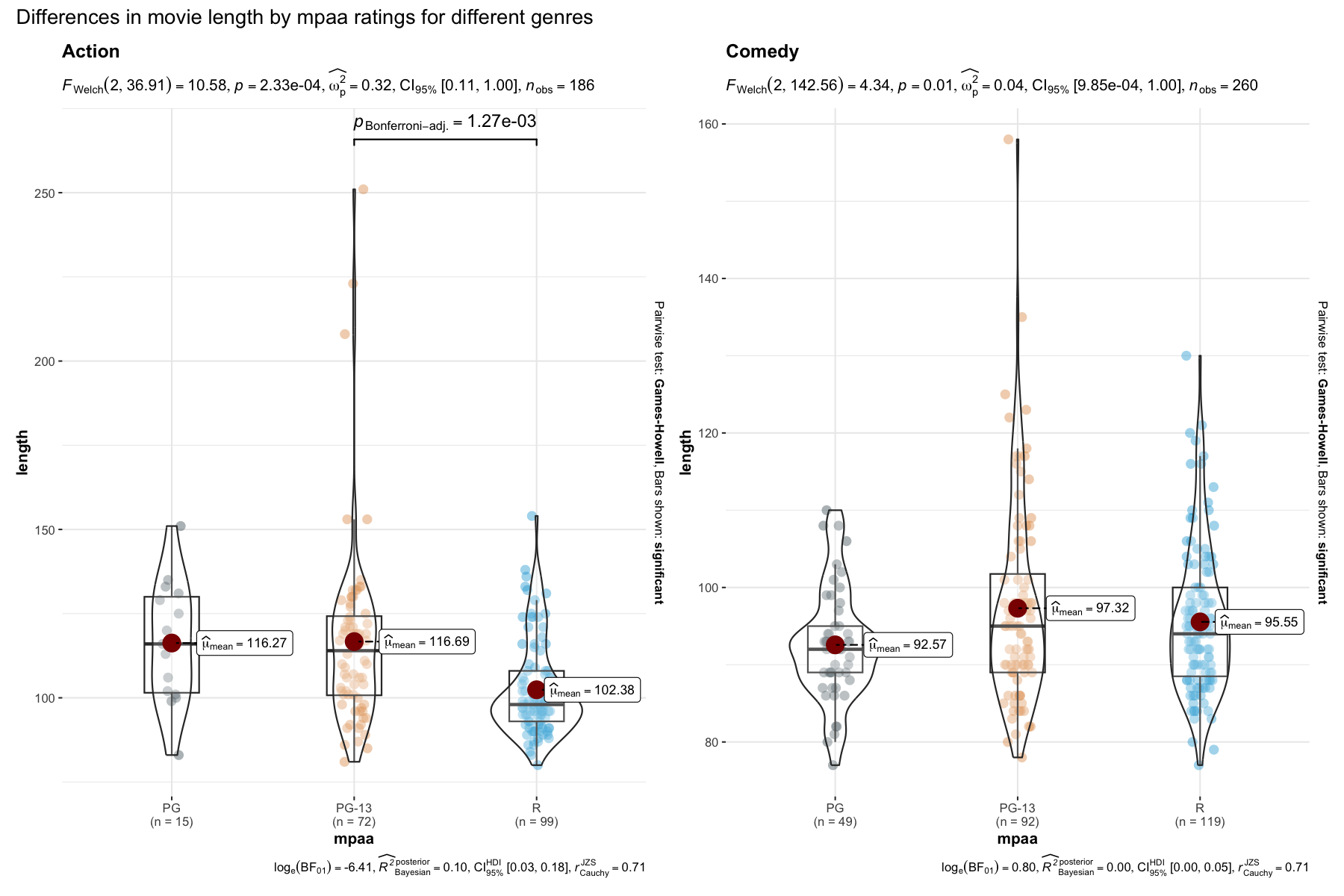
more informative or change some of the default options. Additionally,
there is also a grouped_ variant of this function that
makes it easy to repeat the same operation across a
single grouping variable:
set.seed(123)

grouped_ggbetweenstats(
  data             = dplyr::filter(movies_long, genre %in% c("Action", "Comedy")),
  x                = mpaa,
  y                = length,
  grouping.var     = genre,
  ggsignif.args    = list(textsize = 4, tip_length = 0.01),
  p.adjust.method  = "bonferroni",
  palette          = "ggsci::default_jama",
  plotgrid.args    = list(nrow = 1),
  annotation.args  = list(title = "Differences in movie length by mpaa ratings for different genres")
)
Details about underlying functions used to create graphics and statistical tests carried out can be found in the function documentation: https://www.indrapatil.com/ggstatsplot/reference/ggbetweenstats.html
For more, also read the following vignette: https://www.indrapatil.com/ggstatsplot/articles/web_only/ggbetweenstats.html
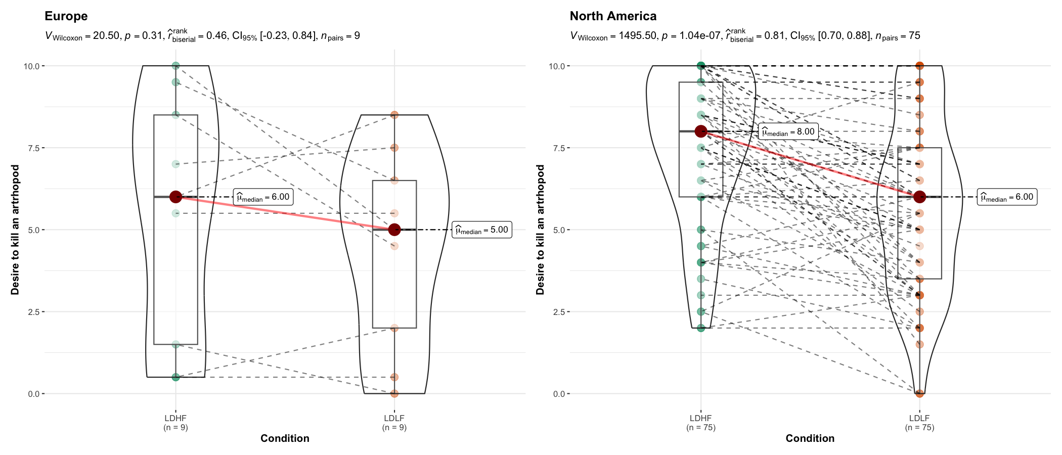
ggwithinstats()ggbetweenstats() function has an identical twin function
ggwithinstats() for repeated measures designs that behaves
in the same fashion with a few minor tweaks introduced to properly
visualize the repeated measures design. As can be seen from an example
below, the only difference between the plot structure is that now the
group means are connected by paths to highlight the fact that these data
are paired with each other.
If your repeated-measures data include an explicit subject
identifier, it is recommended that you pass it via
subject.id; rows with missing identifiers are ignored for
paired grouping and repeated-measures statistics.
set.seed(123)
library(WRS2) ## for data
library(afex) ## to run ANOVA

ggwithinstats(
  data       = WineTasting,
  x          = Wine,
  y          = Taste,
  subject.id = Taster,
  title      = "Wine tasting"
)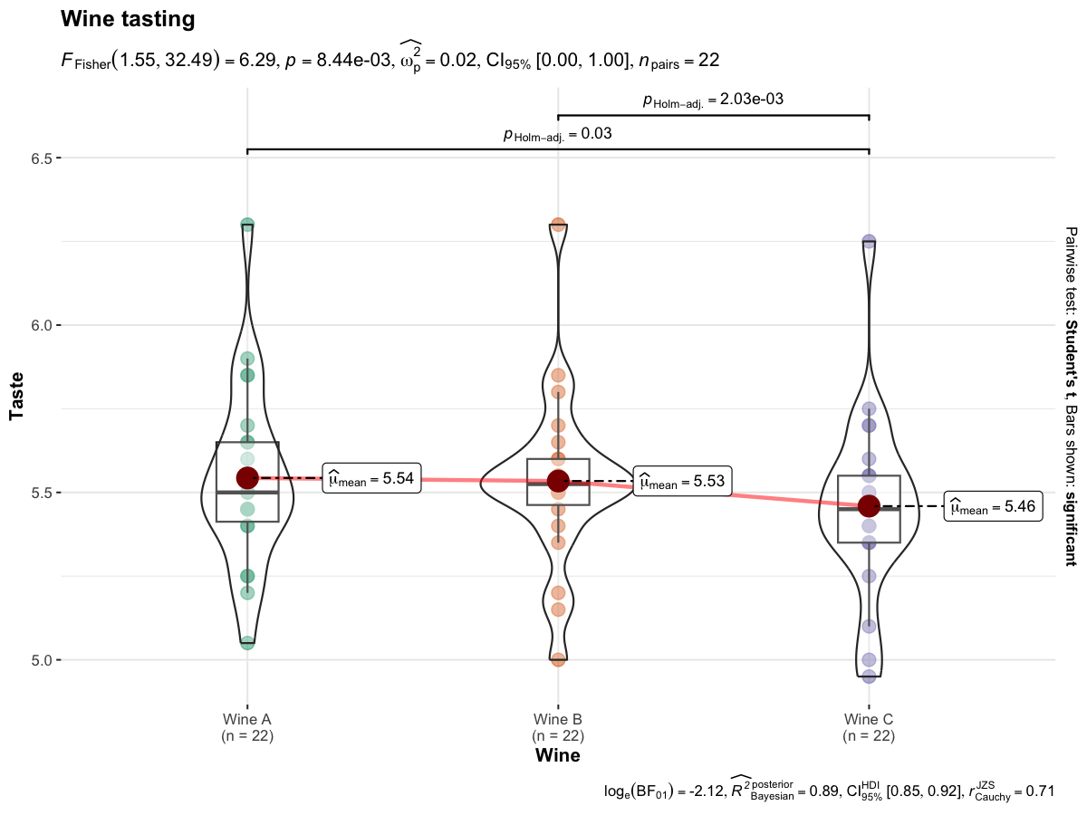
Defaults return
✅ raw data + distributions
✅ descriptive statistics
✅
inferential statistics
✅ effect size + CIs
✅ pairwise
comparisons
✅ Bayesian hypothesis-testing
✅ Bayesian
estimation
As with the ggbetweenstats(), this function also has a
grouped_ variant that makes repeating the same analysis
across a single grouping variable quicker. We will see an example with
only repeated measurements-
set.seed(123)

grouped_ggwithinstats(
  data            = dplyr::filter(bugs_long, region %in% c("Europe", "North America"), condition %in% c("LDLF", "LDHF")),
  x               = condition,
  y               = desire,
  subject.id      = subject,
  type            = "np",
  xlab            = "Condition",
  ylab            = "Desire to kill an artrhopod",
  grouping.var    = region
)
Details about underlying functions used to create graphics and statistical tests carried out can be found in the function documentation: https://www.indrapatil.com/ggstatsplot/reference/ggwithinstats.html
For more, also read the following vignette: https://www.indrapatil.com/ggstatsplot/articles/web_only/ggwithinstats.html
gghistostats()To visualize the distribution of a single variable and check if its
mean is significantly different from a specified value with a one-sample
test, gghistostats() can be used.
set.seed(123)

gghistostats(
  data       = ggplot2::msleep,
  x          = awake,
  title      = "Amount of time spent awake",
  test.value = 12,
  binwidth   = 1
)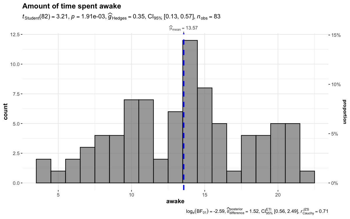
Defaults return
✅ counts + proportion for bins
✅ descriptive statistics
✅
inferential statistics
✅ effect size + CIs
✅ Bayesian
hypothesis-testing
✅ Bayesian estimation
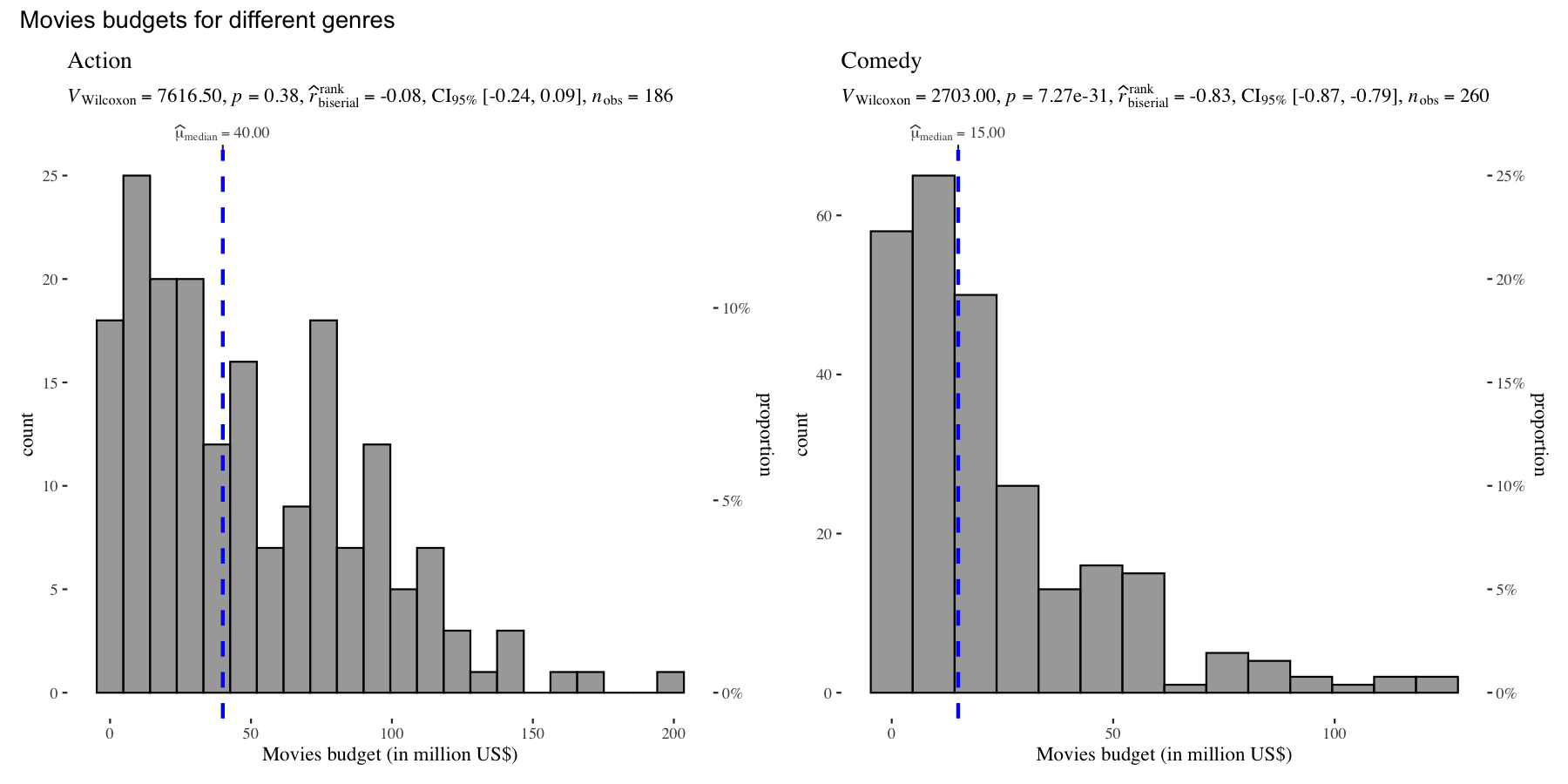
There is also a grouped_ variant of this function that
makes it easy to repeat the same operation across a
single grouping variable:
set.seed(123)

grouped_gghistostats(
  data              = dplyr::filter(movies_long, genre %in% c("Action", "Comedy")),
  x                 = budget,
  test.value        = 50,
  type              = "nonparametric",
  xlab              = "Movies budget (in million US$)",
  grouping.var      = genre,
  ggtheme           = ggthemes::theme_tufte(),
  ## modify the defaults from `{ggstatsplot}` for each plot
  plotgrid.args     = list(nrow = 1),
  annotation.args   = list(title = "Movies budgets for different genres")
)
Details about underlying functions used to create graphics and statistical tests carried out can be found in the function documentation: https://www.indrapatil.com/ggstatsplot/reference/gghistostats.html
For more, also read the following vignette: https://www.indrapatil.com/ggstatsplot/articles/web_only/gghistostats.html
ggdotplotstats()This function is similar to gghistostats(), but is
intended to be used when the numeric variable also has a label.
set.seed(123)

ggdotplotstats(
  data       = dplyr::filter(gapminder::gapminder, continent == "Asia"),
  y          = country,
  x          = lifeExp,
  test.value = 55,
  type       = "robust",
  title      = "Distribution of life expectancy in Asian continent",
  xlab       = "Life expectancy"
)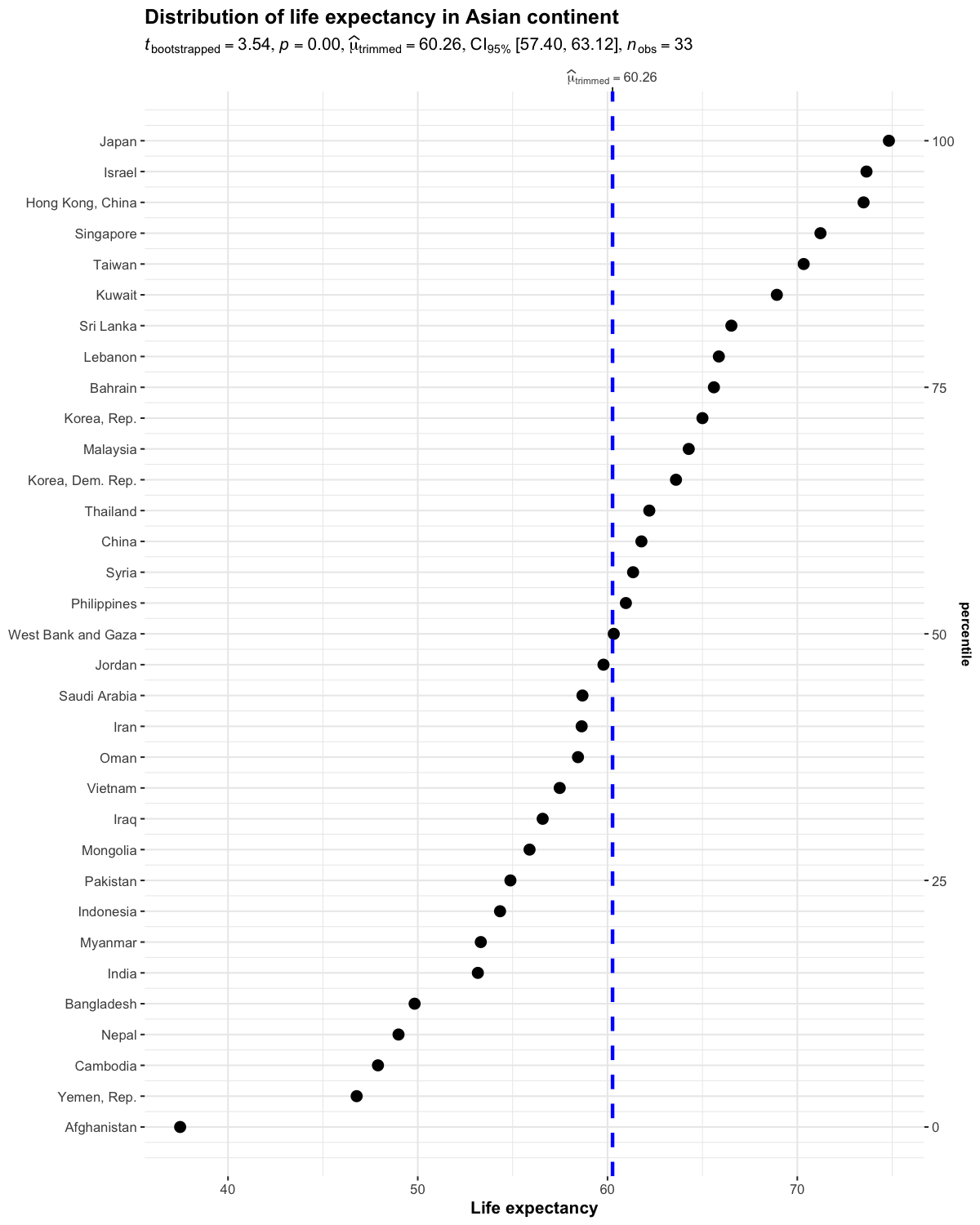
Defaults return
✅descriptives (centrality measure + uncertainty + sample size)
✅ inferential statistics
✅ effect size + CIs
✅ Bayesian
hypothesis-testing
✅ Bayesian estimation
As with the rest of the functions in this package, there is also a
grouped_ variant of this function to facilitate looping the
same operation for all levels of a single grouping variable.
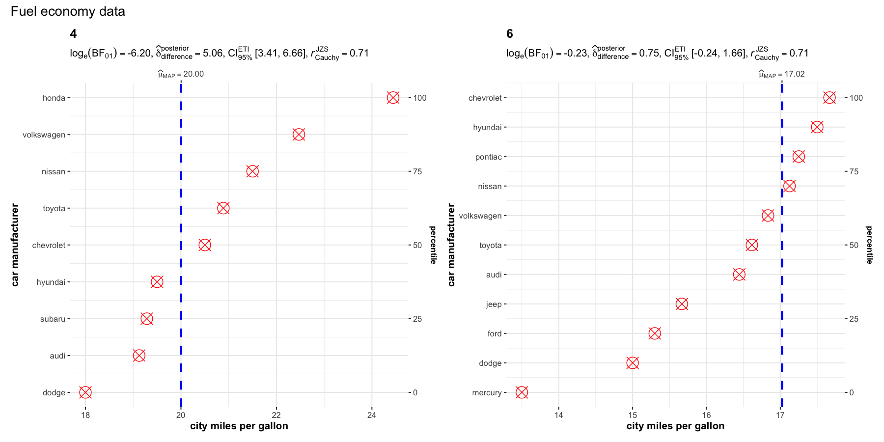
set.seed(123)

grouped_ggdotplotstats(
  data            = dplyr::filter(ggplot2::mpg, cyl %in% c("4", "6")),
  x               = cty,
  y               = manufacturer,
  type            = "bayes",
  xlab            = "city miles per gallon",
  ylab            = "car manufacturer",
  grouping.var    = cyl,
  test.value      = 15.5,
  point.args      = list(color = "red", size = 5, shape = 13),
  annotation.args = list(title = "Fuel economy data")
)
Details about underlying functions used to create graphics and statistical tests carried out can be found in the function documentation: https://www.indrapatil.com/ggstatsplot/reference/ggdotplotstats.html
For more, also read the following vignette: https://www.indrapatil.com/ggstatsplot/articles/web_only/ggdotplotstats.html
ggscatterstats()This function creates a scatterplot with marginal distributions overlaid on the axes and results from statistical tests in the subtitle:
ggscatterstats(
  data  = ggplot2::msleep,
  x     = sleep_rem,
  y     = awake,
  xlab  = "REM sleep (in hours)",
  ylab  = "Amount of time spent awake (in hours)",
  title = "Understanding mammalian sleep"
)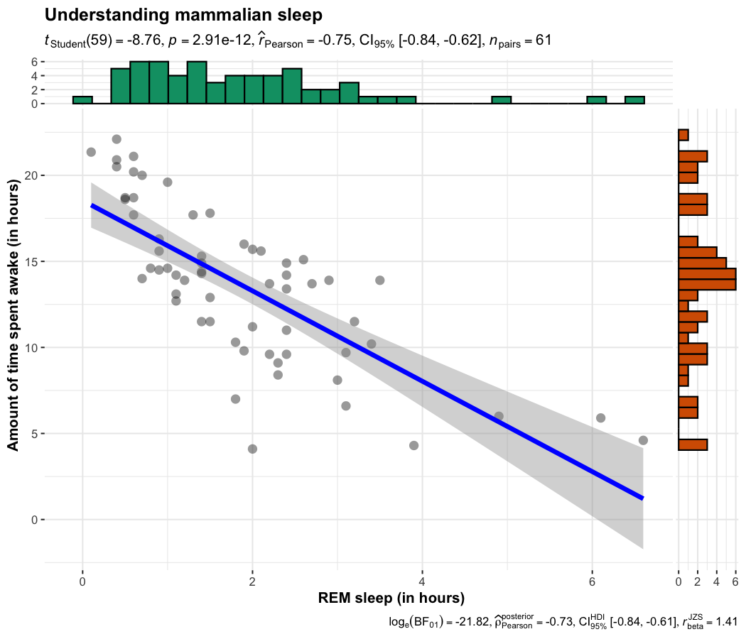
Defaults return
✅ raw data + distributions
✅ marginal distributions
✅
inferential statistics
✅ effect size + CIs
✅ Bayesian
hypothesis-testing
✅ Bayesian estimation
There is also a grouped_ variant of this function that
makes it easy to repeat the same operation across a
single grouping variable.
set.seed(123)
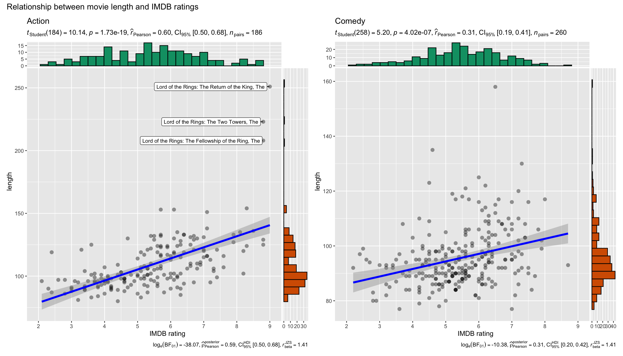
grouped_ggscatterstats(
data = dplyr::filter(movies_long, genre %in% c("Action", "Comedy")),
x = rating,
y = length,
grouping.var = genre,
label.var = title,
label.expression = length > 200,
xlab = "IMDB rating",
ggtheme = ggplot2::theme_grey(),
ggplot.component = list(ggplot2::scale_x_continuous(breaks = seq(2, 9, 1), limits = (c(2, 9)))),
plotgrid.args = list(nrow = 1),
annotation.args = list(title = "Relationship between movie length and IMDB ratings")
)
Details about underlying functions used to create graphics and statistical tests carried out can be found in the function documentation: https://www.indrapatil.com/ggstatsplot/reference/ggscatterstats.html
For more, also read the following vignette: https://www.indrapatil.com/ggstatsplot/articles/web_only/ggscatterstats.html
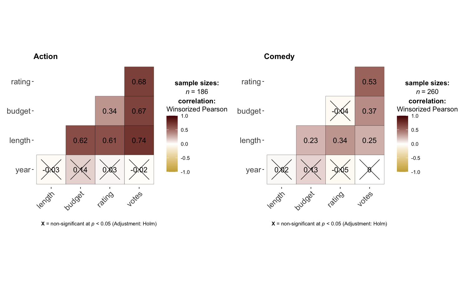
ggcorrmatggcorrmat makes a correlalogram (a matrix of correlation
coefficients) with minimal amount of code. Just sticking to the defaults
itself produces publication-ready correlation matrices. But, for the
sake of exploring the available options, let’s change some of the
defaults. For example, multiple aesthetics-related arguments can be
modified to change the appearance of the correlation matrix.
set.seed(123)

## as a default this function outputs a correlation matrix plot
ggcorrmat(
  data     = ggplot2::msleep,
  colors   = c("#B2182B", "white", "#4D4D4D"),
  title    = "Correlalogram for mammals sleep dataset",
  subtitle = "sleep units: hours; weight units: kilograms"
)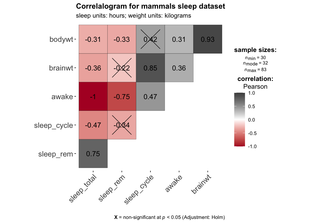
Defaults return
✅ effect size + significance
✅ careful handling of
NAs
If there are NAs present in the selected variables, the
legend will display minimum, median, and maximum number of pairs used
for correlation tests.
There is also a grouped_ variant of this function that
makes it easy to repeat the same operation across a
single grouping variable:
set.seed(123)

grouped_ggcorrmat(
  data            = dplyr::filter(movies_long, genre %in% c("Action", "Comedy")),
  type            = "robust",
  colors          = c("#cbac43", "white", "#550000"),
  grouping.var    = genre,
  p.adjust.method = "fdr",
  matrix.type     = "lower"
)
Details about underlying functions used to create graphics and statistical tests carried out can be found in the function documentation: https://www.indrapatil.com/ggstatsplot/reference/ggcorrmat.html
For more, also read the following vignette: https://www.indrapatil.com/ggstatsplot/articles/web_only/ggcorrmat.html
ggpiestats()This function creates a pie chart for categorical or nominal variables with results from contingency table analysis (Pearson’s chi-squared test for between-subjects design and McNemar’s chi-squared test for within-subjects design) included in the subtitle of the plot. If only one categorical variable is entered, results from one-sample proportion test (i.e., a chi-squared goodness of fit test) will be displayed as a subtitle.
To study an interaction between two categorical variables:
set.seed(123)

ggpiestats(
  data         = mtcars,
  x            = am,
  y            = cyl,
  palette      = "wesanderson::Royal1",
  title        = "Dataset: Motor Trend Car Road Tests",
  legend.title = "Transmission"
)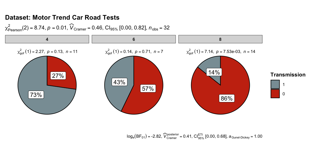
Defaults return
✅ descriptives (frequency + %s)
✅ inferential statistics
✅ effect size + CIs
✅ Goodness-of-fit tests
✅ Bayesian
hypothesis-testing
✅ Bayesian estimation
There is also a grouped_ variant of this function that
makes it easy to repeat the same operation across a
single grouping variable. Following example is a case
where the theoretical question is about proportions for different levels
of a single nominal variable:
set.seed(123)
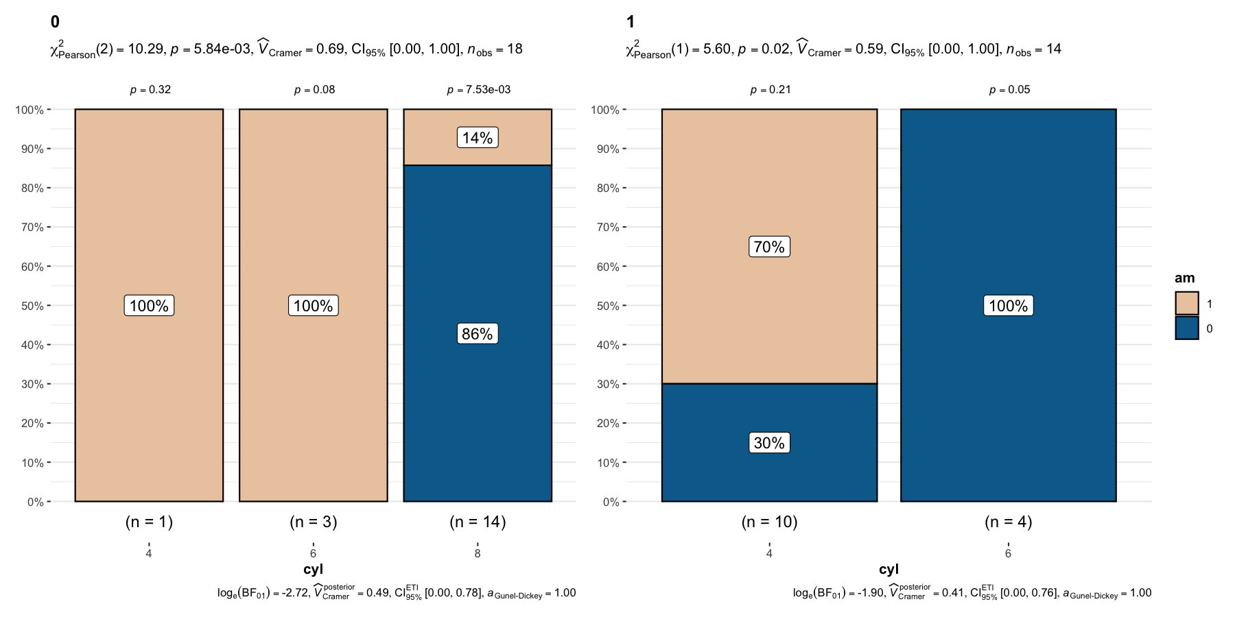
grouped_ggpiestats(
data = mtcars,
x = cyl,
grouping.var = am,
label.repel = TRUE,
palette = "ggsci::default_ucscgb"
)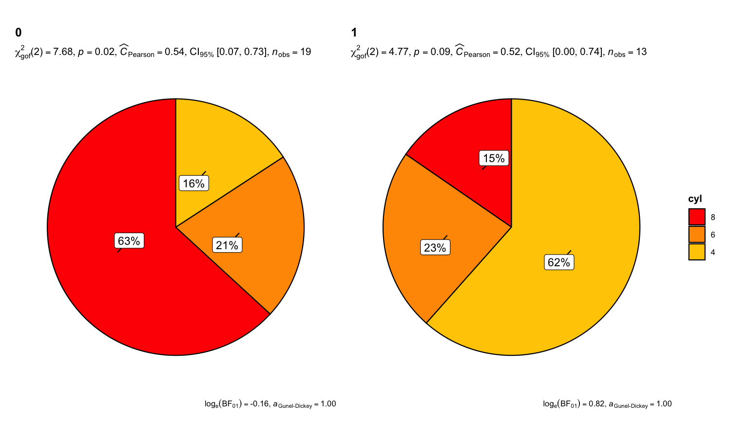
Details about underlying functions used to create graphics and statistical tests carried out can be found in the function documentation: https://www.indrapatil.com/ggstatsplot/reference/ggpiestats.html
For more, also read the following vignette: https://www.indrapatil.com/ggstatsplot/articles/web_only/ggpiestats.html
ggbarstats()In case you are not a fan of pie charts (for very good reasons), you
can alternatively use ggbarstats() function which has a
similar syntax—including support for one-sample goodness-of-fit
tests.
To study an interaction between two categorical variables:
set.seed(123)
library(ggplot2)

ggbarstats(
  data             = movies_long,
  x                = mpaa,
  y                = genre,
  title            = "MPAA Ratings by Genre",
  xlab             = "movie genre",
  legend.title     = "MPAA rating",
  ggplot.component = list(ggplot2::scale_x_discrete(guide = ggplot2::guide_axis(n.dodge = 2))),
  palette          = "RColorBrewer::Set2"
)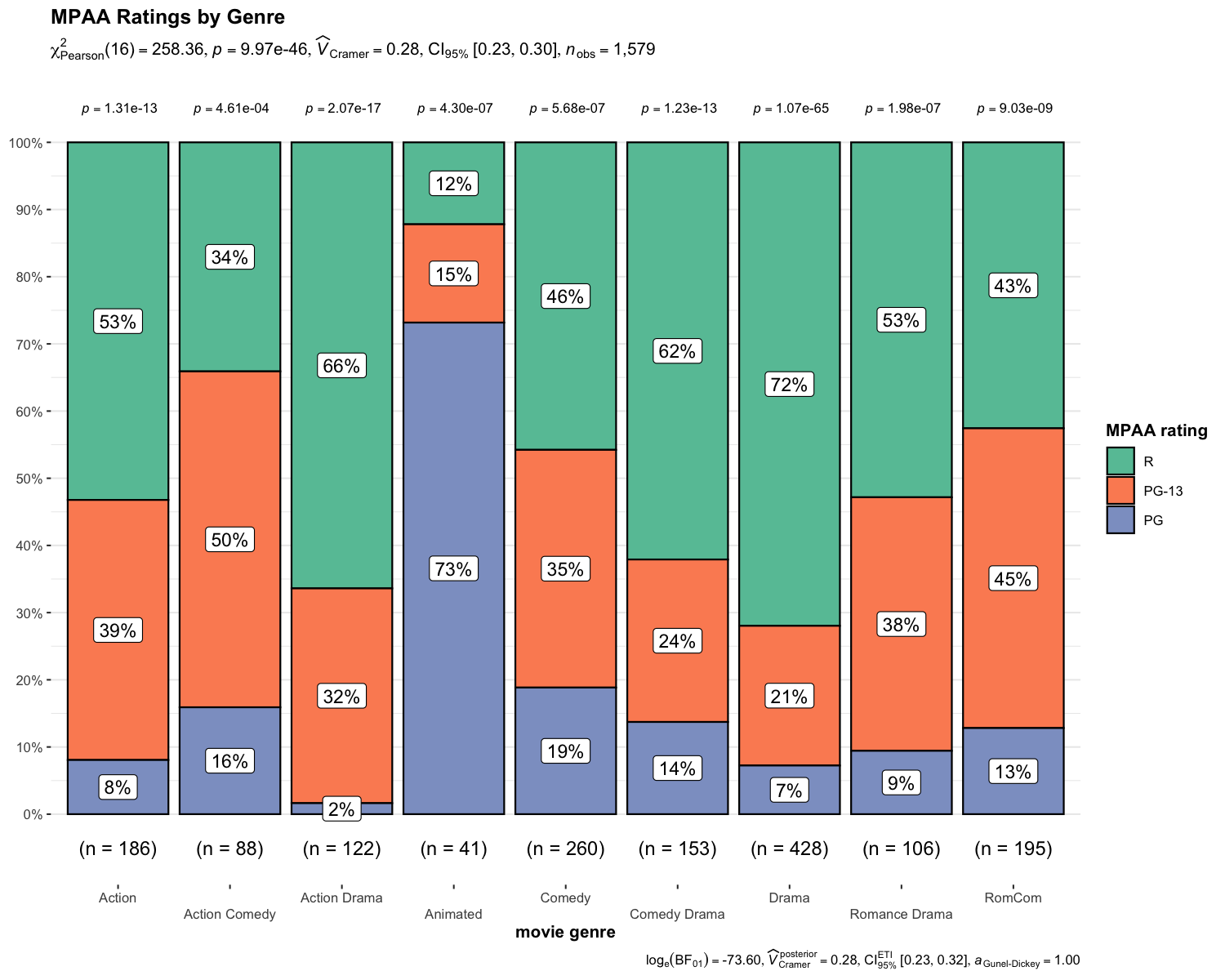
Defaults return
✅ descriptives (frequency + %s)
✅ inferential statistics
✅ effect size + CIs
✅ Goodness-of-fit tests
✅ Bayesian
hypothesis-testing
✅ Bayesian estimation
There is also a grouped_ variant of this function that
makes it easy to repeat the same operation across a
single grouping variable. Following example is a case
where the theoretical question is about proportions for different levels
of a single nominal variable:
set.seed(123)

grouped_ggbarstats(
  data         = mtcars,
  x            = cyl,
  grouping.var = am,
  label.repel  = TRUE,
  palette      = "ggsci::default_ucscgb"
)
Details about underlying functions used to create graphics and statistical tests carried out can be found in the function documentation: https://www.indrapatil.com/ggstatsplot/reference/ggbarstats.html
For more, also read the following vignette: https://www.indrapatil.com/ggstatsplot/articles/web_only/ggbarstats.html
ggcoefstats()The function ggcoefstats() generates
dot-and-whisker plots for regression models. The tidy
data frames are prepared using
parameters::model_parameters(). Additionally, if available,
the model summary indices are also extracted from
performance::model_performance().
set.seed(123)

## model
mod <- stats::lm(formula = mpg ~ am * cyl, data = mtcars)

ggcoefstats(mod)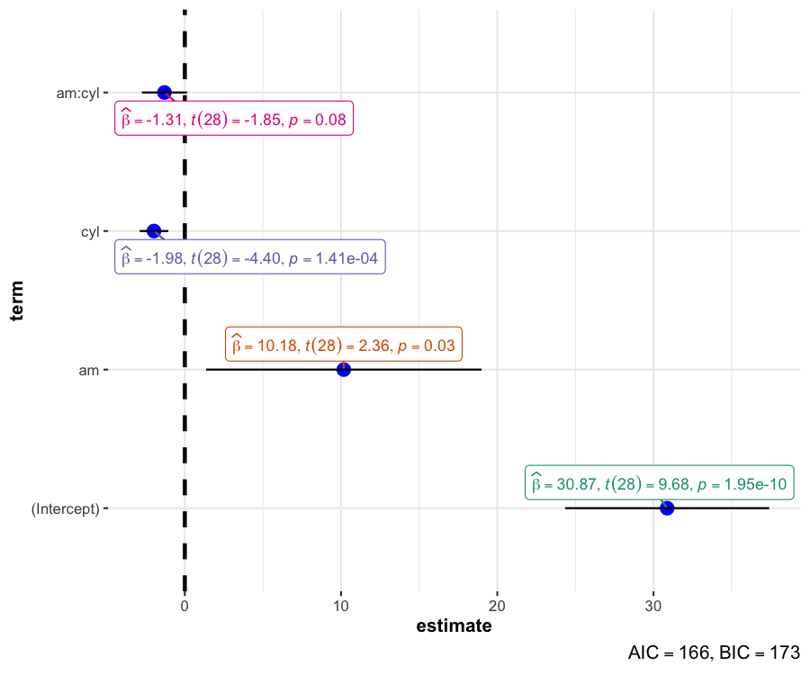
Defaults return
✅ inferential statistics
✅ estimate + CIs
✅ model
summary (AIC and BIC)
Details about underlying functions used to create graphics and statistical tests carried out can be found in the function documentation: https://www.indrapatil.com/ggstatsplot/reference/ggcoefstats.html
For more, also read the following vignette: https://www.indrapatil.com/ggstatsplot/articles/web_only/ggcoefstats.html
{ggstatsplot} also offers a convenience function to
extract data frames with statistical details that are used to create
expressions displayed in {ggstatsplot} plots.
set.seed(123)

p <- ggbetweenstats(mtcars, cyl, mpg)

# extracting expression present in the subtitle
extract_subtitle(p)
#> list(italic("F")["Welch"](2, 18.03) == "31.62", italic(p) ==
#>     "1.27e-06", widehat(omega["p"]^2) == "0.74", CI["95%"] ~
#>     "[" * "0.53", "1.00" * "]", italic("n")["obs"] == "32")

# extracting expression present in the caption
extract_caption(p)
#> list(log[e] * (BF["01"]) == "-14.92", widehat(italic(R^"2"))["Bayesian"]^"posterior" ==
#>     "0.71", CI["95%"]^HDI ~ "[" * "0.57", "0.79" * "]", italic("r")["Cauchy"]^"JZS" ==
#>     "0.71")

# a list of tibbles containing statistical analysis summaries
extract_stats(p)
#> $subtitle_data
#> # A tibble: 1 × 14
#>   statistic    df df.error    p.value
#>       <dbl> <dbl>    <dbl>      <dbl>
#> 1      31.6     2     18.0 0.00000127
#>   method                                                   effectsize estimate
#>   <chr>                                                    <chr>         <dbl>
#> 1 One-way analysis of means (not assuming equal variances) Omega2        0.744
#>   conf.level conf.low conf.high conf.method conf.distribution n.obs expression
#>        <dbl>    <dbl>     <dbl> <chr>       <chr>             <int> <list>
#> 1       0.95    0.531         1 ncp         F                    32 <language>
#>
#> $caption_data
#> # A tibble: 6 × 17
#>   term     pd prior.distribution prior.location prior.scale     bf10
#>   <chr> <dbl> <chr>                       <dbl>       <dbl>    <dbl>
#> 1 mu    1     cauchy                          0       0.707 3008850.
#> 2 cyl-4 1     cauchy                          0       0.707 3008850.
#> 3 cyl-6 0.780 cauchy                          0       0.707 3008850.
#> 4 cyl-8 1     cauchy                          0       0.707 3008850.
#> 5 sig2  1     cauchy                          0       0.707 3008850.
#> 6 g_cyl 1     cauchy                          0       0.707 3008850.
#>   method                          log_e_bf10 effectsize         estimate std.dev
#>   <chr>                                <dbl> <chr>                 <dbl>   <dbl>
#> 1 Bayes factors for linear models       14.9 Bayesian R-squared    0.714  0.0503
#> 2 Bayes factors for linear models       14.9 Bayesian R-squared    0.714  0.0503
#> 3 Bayes factors for linear models       14.9 Bayesian R-squared    0.714  0.0503
#> 4 Bayes factors for linear models       14.9 Bayesian R-squared    0.714  0.0503
#> 5 Bayes factors for linear models       14.9 Bayesian R-squared    0.714  0.0503
#> 6 Bayes factors for linear models       14.9 Bayesian R-squared    0.714  0.0503
#>   conf.level conf.low conf.high conf.method n.obs expression
#>        <dbl>    <dbl>     <dbl> <chr>       <int> <list>
#> 1       0.95    0.574     0.788 HDI            32 <language>
#> 2       0.95    0.574     0.788 HDI            32 <language>
#> 3       0.95    0.574     0.788 HDI            32 <language>
#> 4       0.95    0.574     0.788 HDI            32 <language>
#> 5       0.95    0.574     0.788 HDI            32 <language>
#> 6       0.95    0.574     0.788 HDI            32 <language>
#>
#> $pairwise_comparisons_data
#> # A tibble: 3 × 9
#>   group1 group2 statistic   p.value alternative distribution p.adjust.method
#>   <chr>  <chr>      <dbl>     <dbl> <chr>       <chr>        <chr>
#> 1 4      6          -6.67 0.00110   two.sided   q            Holm
#> 2 4      8         -10.7  0.0000140 two.sided   q            Holm
#> 3 6      8          -7.48 0.000257  two.sided   q            Holm
#>   test         expression
#>   <chr>        <list>
#> 1 Games-Howell <language>
#> 2 Games-Howell <language>
#> 3 Games-Howell <language>
#>
#> $descriptive_data
#> NULL
#>
#> $one_sample_data
#> NULL
#>
#> $tidy_data
#> NULL
#>
#> $glance_data
#> NULL
#>
#> attr(,"class")
#> [1] "ggstatsplot_stats" "list"
Note that all of this analysis is carried out by
{statsExpressions} package: https://www.indrapatil.com/statsExpressions/
{ggstatsplot} statistical details with custom plotsSometimes you may not like the default plots produced by
{ggstatsplot}. In such cases, you can use other
custom plots (from {ggplot2} or other
plotting packages) and still use {ggstatsplot} functions to
display results from relevant statistical test.
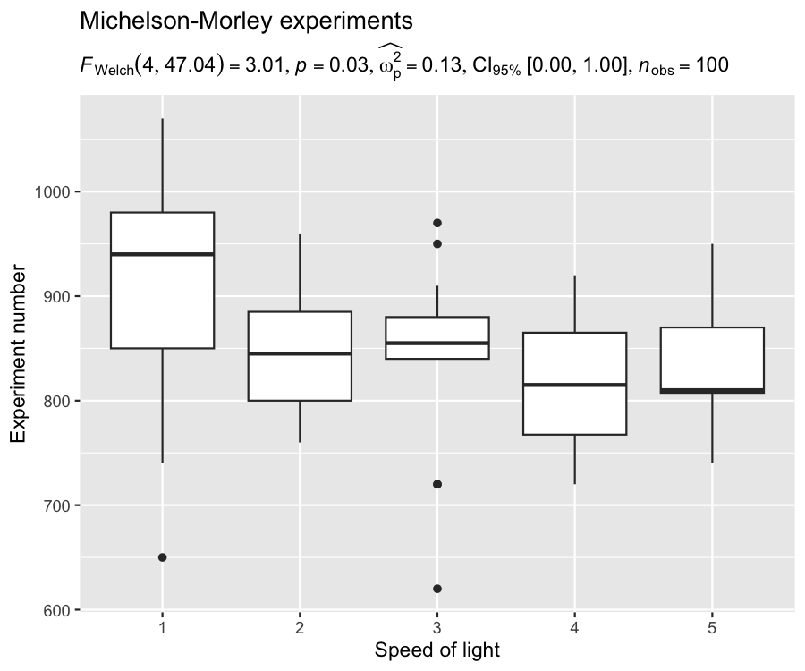
For example, in the following chunk, we will create our own plot
using {ggplot2} package, and use {ggstatsplot}
function for extracting expression:
## loading the needed libraries
set.seed(123)
library(ggplot2)

## using `{ggstatsplot}` to get expression with statistical results
stats_results <- ggbetweenstats(morley, Expt, Speed) |> extract_subtitle()

## creating a custom plot of our choosing
ggplot(morley, aes(x = as.factor(Expt), y = Speed)) +
  geom_boxplot() +
  labs(
    title = "Michelson-Morley experiments",
    subtitle = stats_results,
    x = "Speed of light",
    y = "Experiment number"
  )
{ggstatsplot}No need to use scores of packages for statistical analysis (e.g., one to get stats, one to get effect sizes, another to get Bayes Factors, and yet another to get pairwise comparisons, etc.).
Minimal amount of code needed for all functions (typically only
data, x, and y), which minimizes
chances of error and makes for tidy scripts.
Conveniently toggle between statistical approaches.
Truly makes your figures worth a thousand words.
No need to copy-paste results to the text editor (MS-Word, e.g.).
Disembodied figures stand on their own and are easy to evaluate for the reader.
More breathing room for theoretical discussion and other text.
No need to worry about updating figures and statistical details separately.
{ggstatsplot}This package is…
❌ an alternative to learning {ggplot2}
✅ (The
better you know {ggplot2}, the more you can modify the
defaults to your liking.)
❌ meant to be used in talks/presentations
✅ (Default plots can
be too complicated for effectively communicating results in
time-constrained presentation settings, e.g. conference talks.)
❌ the only game in town
✅ (GUI software alternatives: JASP and jamovi).
In case you use the GUI software jamovi, you can install
a module called jjstatsplot,
which is a wrapper around {ggstatsplot}.
I’m happy to receive bug reports, suggestions, questions, and (most
of all) contributions to fix problems and add features. I personally
prefer using the GitHub issues system over trying to reach
out to me in other ways (personal e-mail, Twitter, etc.). Pull Requests
for contributions are encouraged.
Here are some simple ways in which you can contribute (in the increasing order of commitment):
Please note that this project is released with a Contributor Code of Conduct. By participating in this project you agree to abide by its terms.