![]()
Introduces geom_pointdensity(): A cross between a
scatter plot and a 2D density plot.
![]()
To install the package, type this command in R:
install.packages("ggpointdensity")

# Alternatively, you can install the latest
# development version from GitHub:
if (!requireNamespace("devtools", quietly = TRUE))
    install.packages("devtools")
devtools::install_github("LKremer/ggpointdensity")There are several ways to visualize data points on a 2D coordinate
system: If you have lots of data points on top of each other,
geom_point() fails to give you an estimate of how many
points are overlapping. geom_density2d() and
geom_bin2d() solve this issue, but they make it impossible
to investigate individual outlier points, which may be of interest.
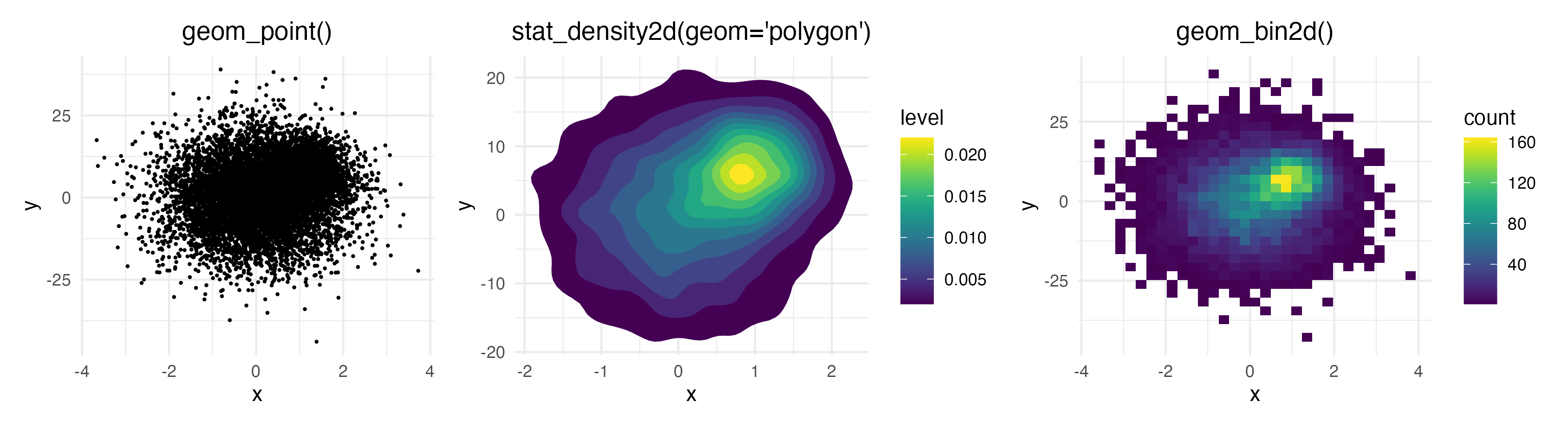
geom_pointdensity() aims to solve this problem by
combining the best of both worlds: individual points are colored by the
number of neighboring points. This allows you to see the overall
distribution, as well as individual points.
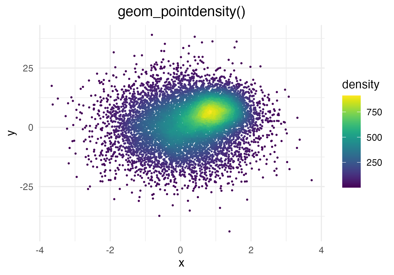
Generate some toy data and visualize it with
geom_pointdensity():
library(ggplot2)
library(dplyr)
library(viridis)
library(ggpointdensity)

dat <- bind_rows(
  tibble(x = rnorm(7000, sd = 1),
         y = rnorm(7000, sd = 10),
         group = "foo"),
  tibble(x = rnorm(3000, mean = 1, sd = .5),
         y = rnorm(3000, mean = 7, sd = 5),
         group = "bar"))

ggplot(data = dat, mapping = aes(x = x, y = y)) +
  geom_pointdensity() +
  scale_color_viridis()
Each point is colored according to the number of neighboring points.
The distance threshold to consider two points as neighbors (smoothing
bandwidth) can be adjusted with the adjust argument, where
adjust = 0.5 means use half of the default bandwidth.
ggplot(data = dat, mapping = aes(x = x, y = y)) +
  geom_pointdensity(adjust = .1) +
  scale_color_viridis()

ggplot(data = dat, mapping = aes(x = x, y = y)) +
  geom_pointdensity(adjust = 4) +
  scale_color_viridis()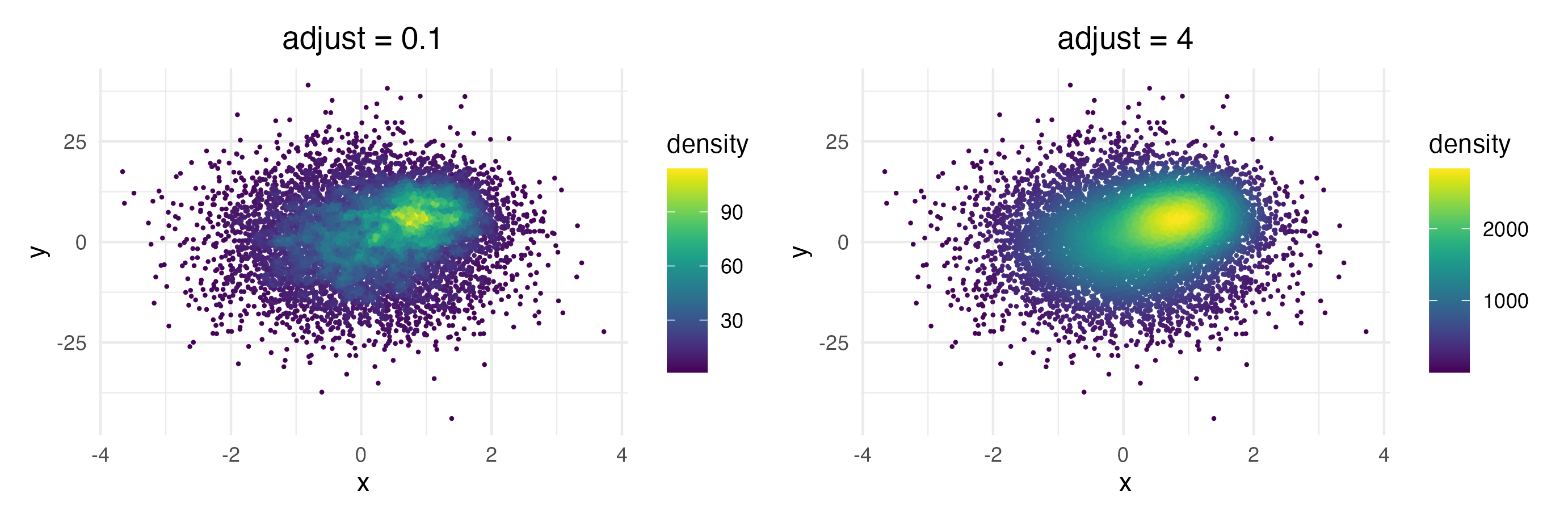
Of course you can combine the geom with standard ggplot2
features such as facets…
# Facetting by group
ggplot(data = dat, mapping = aes(x = x, y = y)) +
  geom_pointdensity() +
  scale_color_viridis() +
  facet_wrap( ~ group)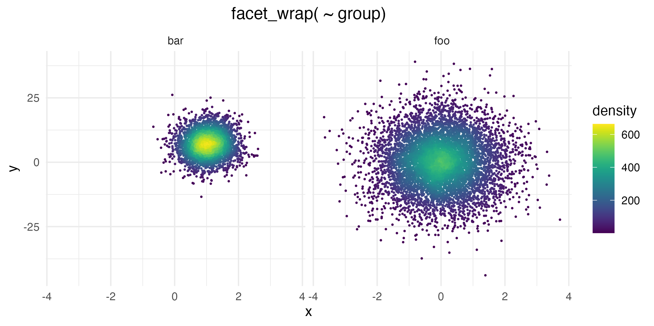
… or point shape and size:
dat_subset <- sample_frac(dat, .1)  # smaller data set
ggplot(data = dat_subset, mapping = aes(x = x, y = y)) +
  geom_pointdensity(size = 3, shape = 17) +
  scale_color_viridis()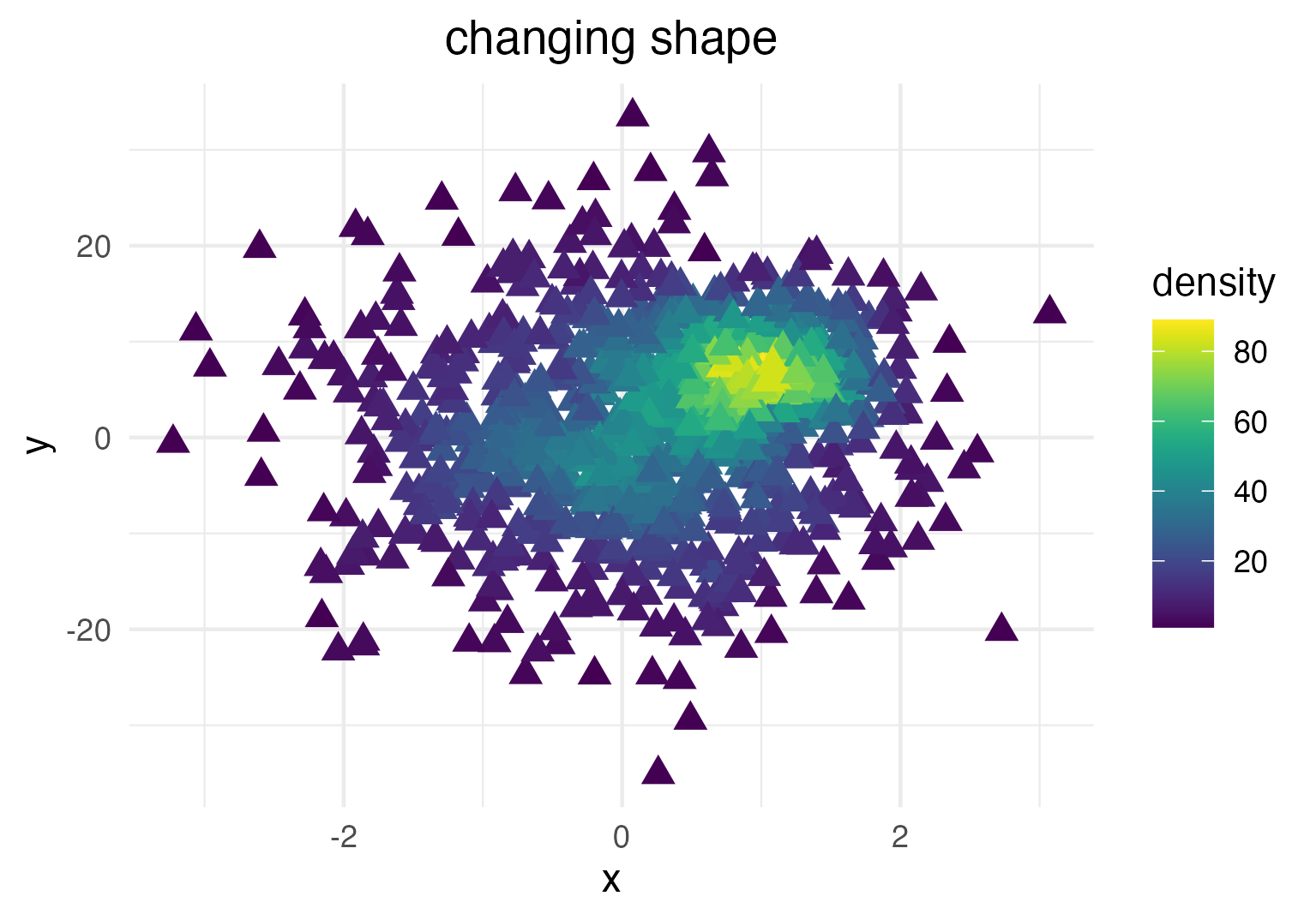
Zooming into the axis works as well, keep in mind that
xlim() and ylim() change the density since
they remove data points. It may be better to use
coord_cartesian() instead.
ggplot(data = dat, mapping = aes(x = x, y = y)) +
  geom_pointdensity() +
  scale_color_viridis() +
  xlim(c(-1, 3)) + ylim(c(-5, 15))

ggplot(data = dat, mapping = aes(x = x, y = y)) +
  geom_pointdensity() +
  scale_color_viridis() +
  coord_cartesian(xlim = c(-1, 3), ylim = c(-5, 15))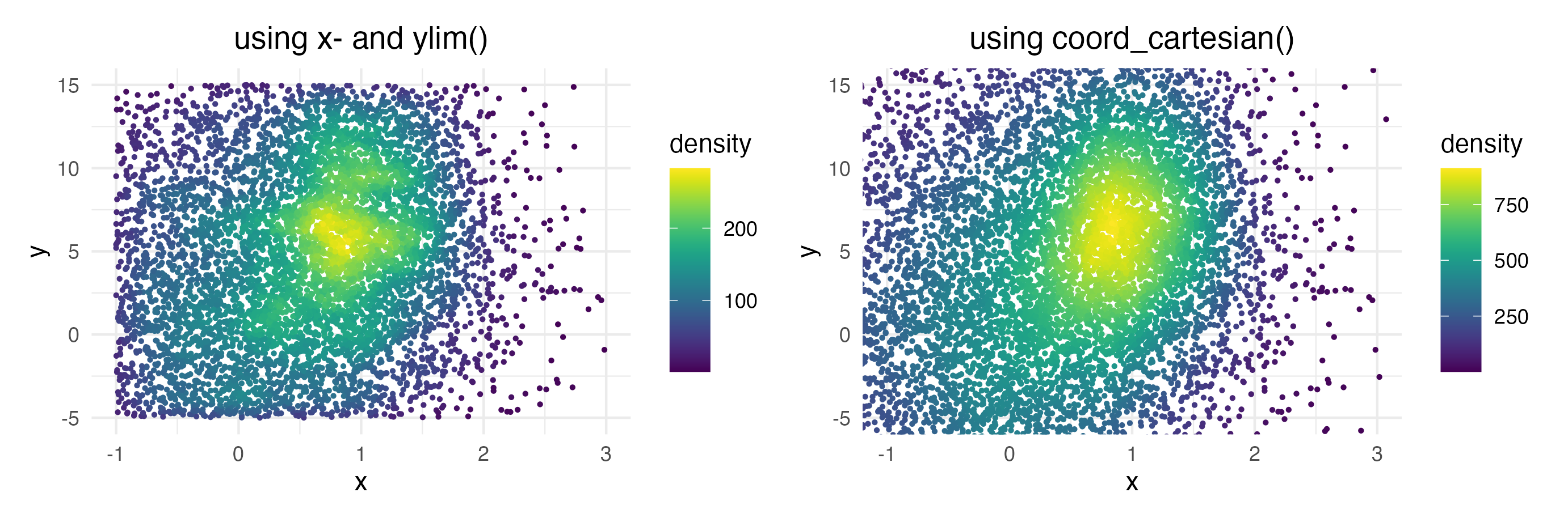
You can re-use or modify the density estimates using ggplot2’s
after_stat() function.
For instance, let’s say you want to plot the density estimates on a
relative instead of an absolute scale, i.e. scaled from 0 to 1.
Of course this can be achieved by dividing the absolute density values
by the maximum, but how do you access the density estimates on R code?
The short answer is to use after_stat(density) inside an
aesthetics mapping like so:
ggplot(data = dat,
       aes(x = x, y = y, color = after_stat(density / max(density)))) +
  geom_pointdensity(size = .3) +
  scale_color_viridis() +
  labs(color = "relative\ndensity")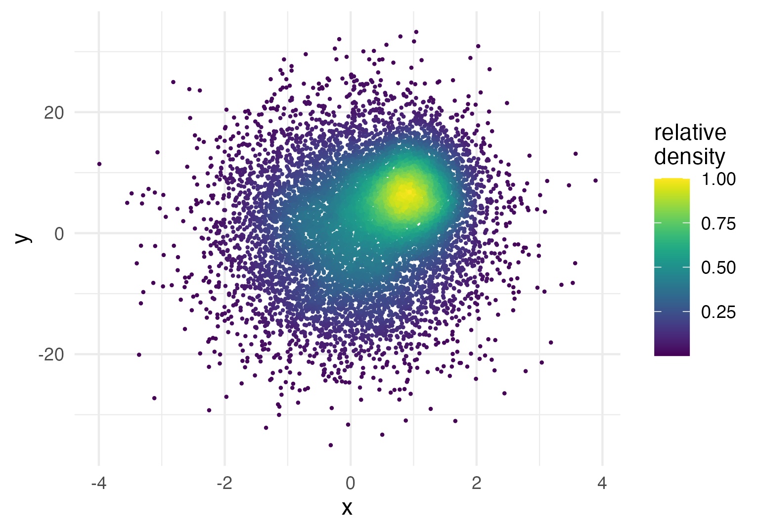
For a more in-depth explanation on after_stat(), check
out the
relevant ggplot documentation.
Since plotting the relative density is a common use-case, we provide
a little shortcut. Instead of the solution above you can simply use
after_stat(ndensity). This is especially useful when
facetting data, since sometimes you want to inspect the point density
separately for each facet:
ggplot(data = dat,
       aes( x = x, y = y, color = after_stat(ndensity))) +
  geom_pointdensity( size = .25) +
  scale_color_viridis() +
  facet_wrap( ~ group) +
  labs(color = "relative\ndensity")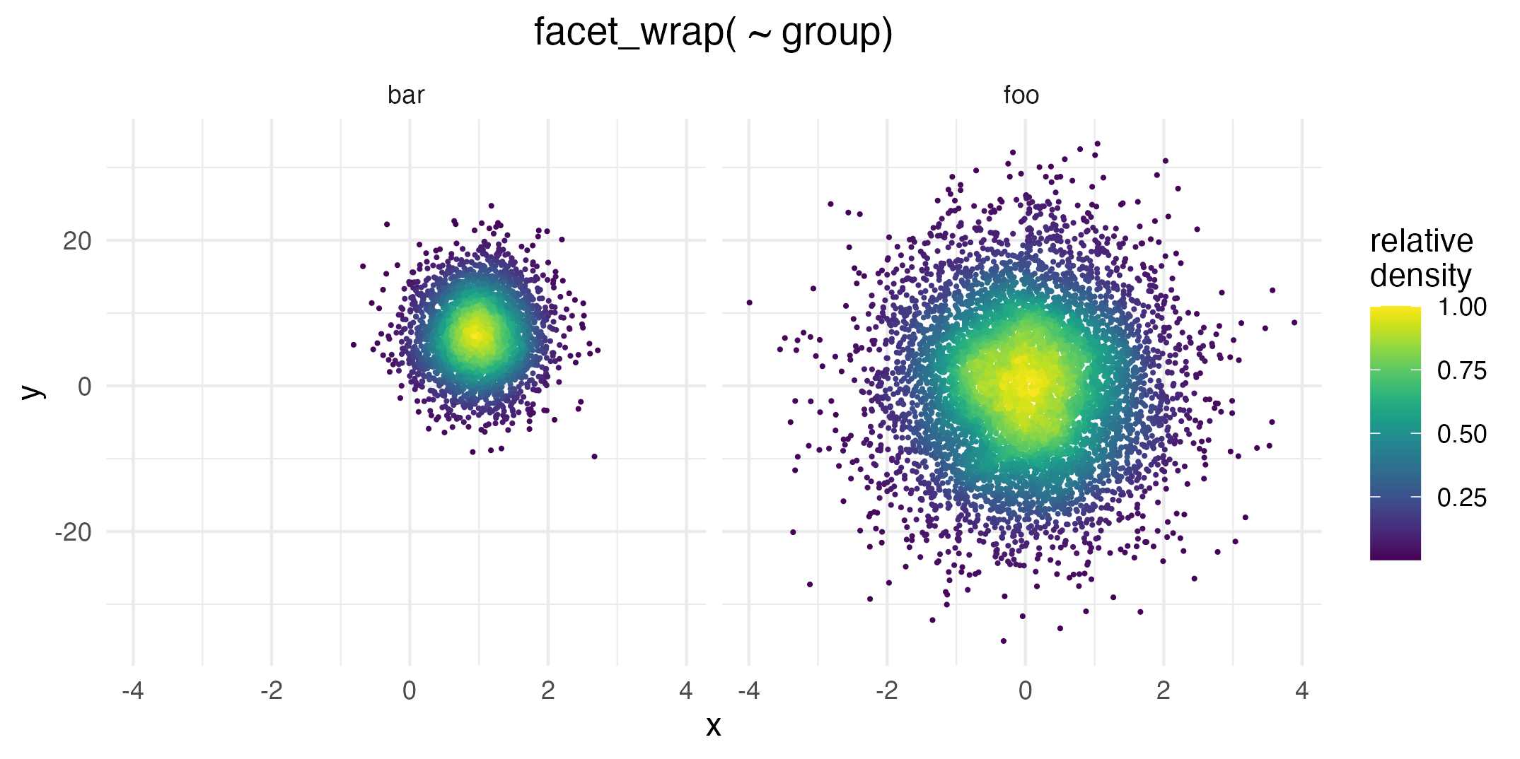
Even though the foo data group is not as dense as
bar overall, this plot uses the whole color scale between 0
and 1 in both facets.
Lastly, you can use after_stat() to affect other plot
aesthetics such as point size:
ggplot(data = dat,
       aes(x = x, y = y, size = after_stat(1 / density ^ 1.8))) +
  geom_pointdensity(adjust = .2) +
  scale_color_viridis() +
  scale_size_continuous(range = c(.001, 3))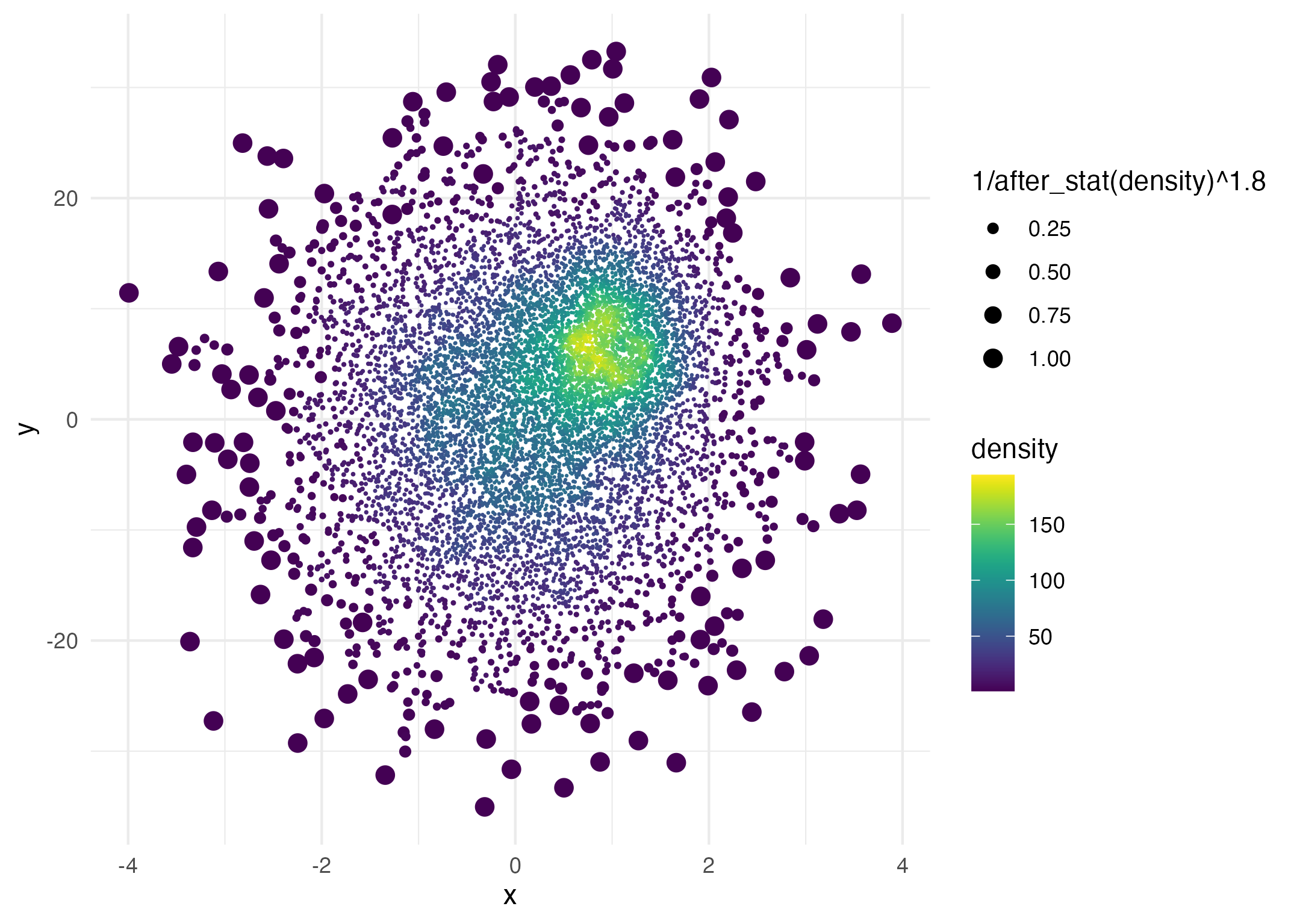
Here the point size is proportional to
1 / density ^ 1.8.
Lukas PM Kremer and Simon Anders, 2019